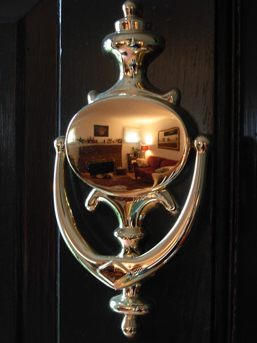
The entire room is reflected in the brass door knocker on the front door. The rest is details such as more artwork, tweaking the lighting, and most likely updating the curtains.
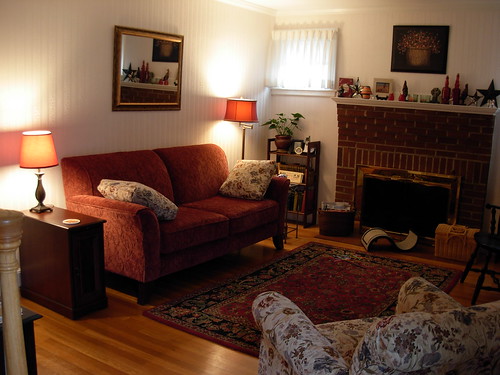 The nearly finished room, a narrower end table was found, warm inlaid cherry wood withinlaid detail and hidden storage. The scale is much more in line with the smaller room, and taller for better drinks reach, making that end of the sofa much more usable. The bronze lamp and red shade pull the table into the room, and make for a second reading seat on the sofa.
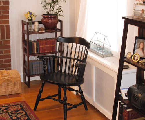
A closeup of the Captain's chair, more black detail, more open space and design, and a very comfy chair to sit in.
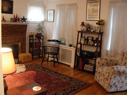
The opposite side of the room, with a simple leaning ladder bookcase takes up very little visual space, but adds much needed storage and display space to the sparse room. A Captain's Carver chair balances the larger upholstered pieces, while not being shoved into the middle of the room because of the radiator behind it. The punny Engelbreit print adds a touch of playfulness and whimsy, while reflecting but not overpowering the colorfulness of the space.
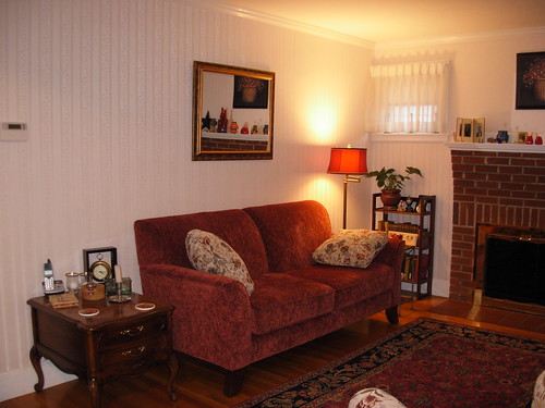 This mirror was a total steal at a local shop, lightweight, with gold trim and a slight reddish wash, it's perfect for highlighting the brasswork on the fireplace, while reflecting the warm reds in the room. Mirrors are great for adding light, and the illusion of more space to small rooms. Grandma's lamp needed a new shade, and as resilking the old one might cost hundreds of dollars, this replacement shade does very nicely, and the original amber finial could be retained. I still haven't found a good replacement for the end table.
 I also decided that the seascape photograph was wasted over the mantle. The soft grey tones were completely washed out by the white background. It was replaced with something smaller and bolder with a folksy painted on wood print using natural earthy tones, as well as red and black. More of a statement and the smaller size keeps it from overpowering the fireplace.
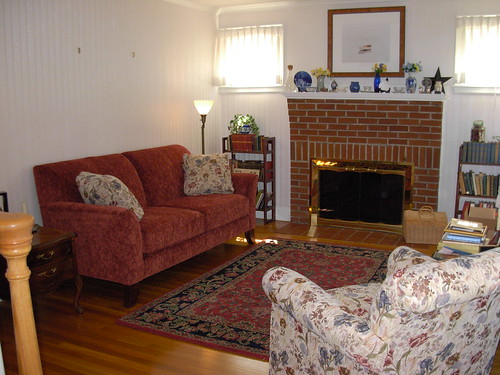 This rug, which was a great deal and all wool, had been under the dining room table. Stolen from that room, it plays up the black front on the fireplace, while the red complements the brick and the sofa upholstery. The black also serves to tone down the red, while highlighting it. The end table is too low, and too big for the scale of the room, and it has to go. It has a twin, but there's no room in this tiny space for it. Now, something is needed over the couch to break up the almost blank white wall but won't overpower it.
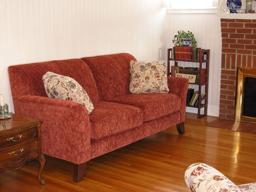
All the boxes finally removed from the front living room, the long sought-after sofa that will make an impact, but not dwarf a tiny 10' x 10' space, is delivered. Bigger than a love seat, smaller than a McMansion behemoth, this red brocade tone on tone piece, does the trick. No skirt to hide the floor visually, with warm wooden curved feet. No piano legs here. Dainty, yet sturdy. Bold but not head-snapping. Warm but not electric. Small bookcases on each side of the fireplace add much needed book storage and display space, and the wood adds to the warmth of the room, while the open design again doesn't block much visual space.
No comments:
Post a Comment